Tutorial Best Practices
Many games live or die based on the effectiveness of the first-time user experience (FTUE) and the game’s ability to retain players after their first session. The most powerful tool for optimizing this aspect of a game’s performance is the initial game tutorial.
When players feel comfortable winning, they are much more likely to move to cash tournaments. This can be accelerated by a great tutorial.
Returning players can forget rules and scoring details, and they may require a refresher to feel confident about their abilities before competing again. Tutorials help to even the playing field by ensuring that everyone understands what is required for success.
Tutorial Optimization - Form and Function
Ensuring that players know how to play is crucial to the first-time user experience. There are four common approaches for integrating tutorials into Skillz games. These are outlined below along with some additional topics covering various formats, where players access tutorials, the essence of a great tutorial, and recommendations on maximizing their efficiency.
Successful Tutorial Configurations
| Slideshow- A paginated collection of topics with focused information about key concepts |
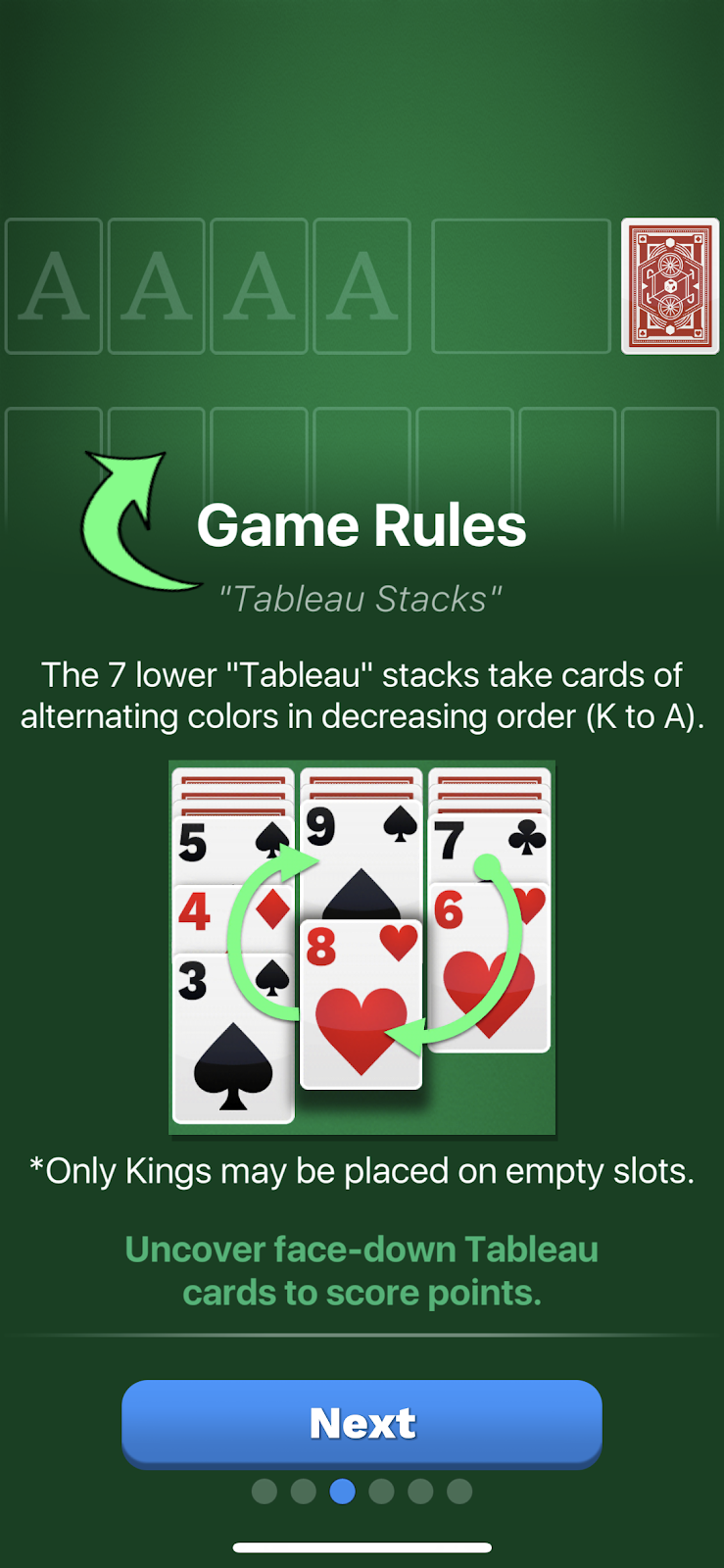 Solitaire Cube |
|
| Infographic - A pre-game screen which highlights key concepts in single, digestible image |
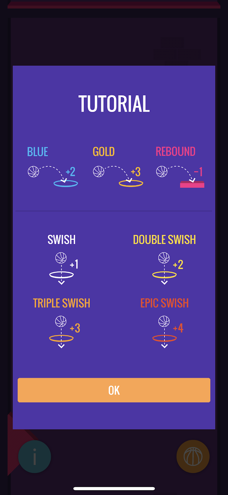 DunkALot Tournaments |
|
| Interactive - Hands on instruction, first describing a concept and then requiring the player to perform it |
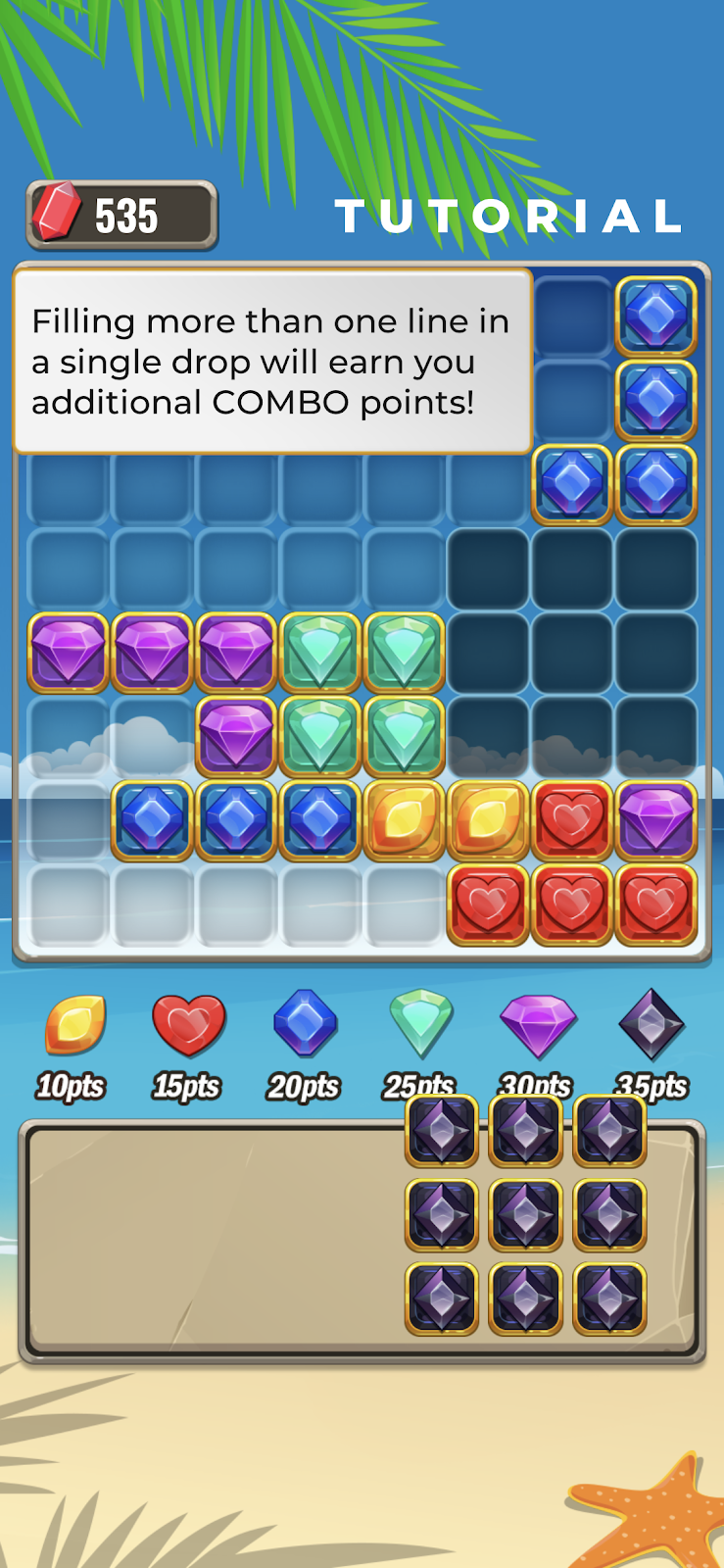 Jewel Blitz |
|
| Video - High-production video showcasing concepts and exciting gameplay |
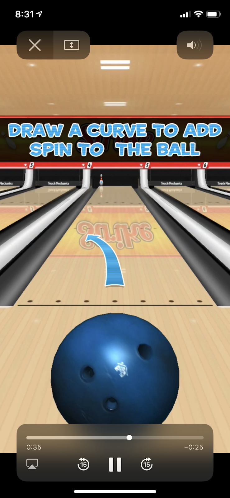 Strike! |
|
Multiple Tutorial Touch Points
There are a few different places where tutorials can be integrated effectively. We recommend that gameplay is always explained to the player in the FTUE, immediately before their first match.
Additionally, not every player will retain all the tutorial information the first time. As a result, there are benefits to utilizing different touchpoints. We suggest granting access to the tutorial from some of the touchpoints defined below:
Immediately Before First Game Begins
| FTUE Tutorial Step | |||
1. Account Creation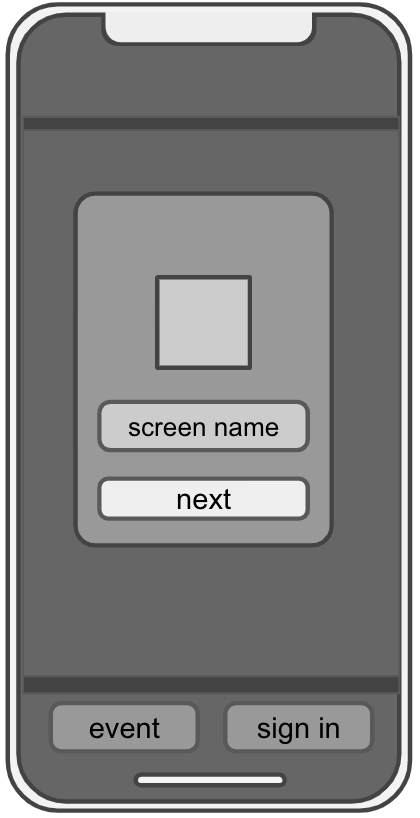 | 2. Matchmaking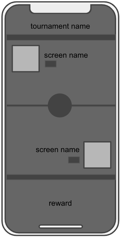 | 3. FTUE Tutorial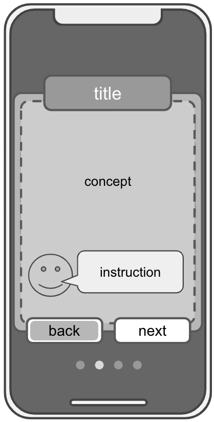 | 4. First Game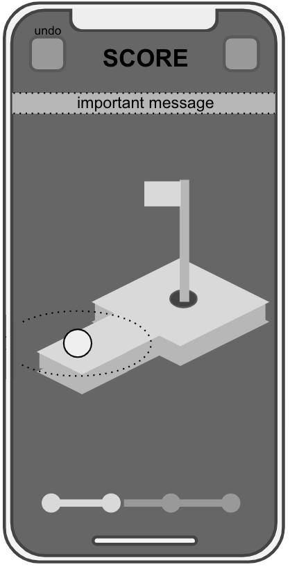 |
On Landing Screen in Later App Loads
On the first load after install, it is important to have as little friction as possible in getting the player to their first real game. Hence, the best practice here is to have the tutorial be part of the FTUE flow, putting it at the start of the gameplay experience when the player enters their first match. After the first load, including the tutorial is valuable as a way for an existing player to be able to refresh their memory on the specifics of the game.
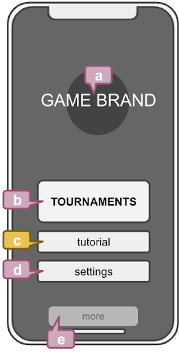 | Title Screen
| |
As Part of the Pre-Game Screen
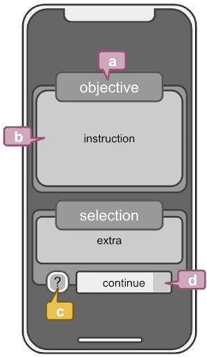 | Pre-Game Screen
| |
Accessible from the Pause Menu
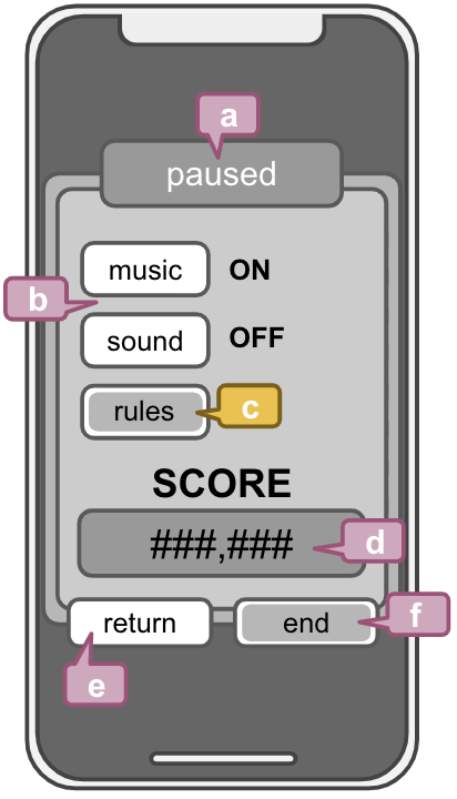 | Pause Menu
| |
Sync Tutorial Best Practices
If a game features a sync (real-time) mode, the tutorial - regardless of the configuration - should include a section at the end explaining that it is possible to play a real-time match with a human opponent. This information should appear in both the async tutorial and the sync tutorial. In fact, unless there is an explicit need to call out sync-only functionality, we recommend the tutorial be the same for both modes. If it is determined that the sync mode absolutely must include different information than the async mode, match info can be used to dynamically determine which tutorial to show.
Data shows that players that experience sync play early on are much more likely to engage with pro tournaments. Any opportunity to remind players that sync play is supported will positively impact a game’s metrics.
For sync games, we also recommend notifying the player that they can play real-time games against a human opponent as soon as they complete their second asynchronous practice match. Currently, the best time to relay this information is immediately upon completion of that second practice match and before the results screen (where the player presses Submit Score), as once the results screen appears, the player must be transitioned directly back to the SDK.
Read more about real-time first time user experience best practices and implementation here.
Tutorial Breakdown
Tutorials teach players fundamental concepts of a game to help them start playing well. This accelerated success is crucial to good monetization, which is why it is important to proactively display a tutorial to the user in their first session. Additionally, the tutorial should be easily accessible in later sessions from a number of different touchpoints to ensure players always have the information they need to succeed.
Key Concepts to Include in Your Tutorial (Priority Order)
- Game goal / core loop - What is the objective and how do you play?
- Game controls - How are the controls configured?
- Special mechanics / power-ups - What else does the player need to know?
- Scoring - How are points earned?
- Tips and Tricks - What essential strategies does the player need to understand?
- Don’t go too deep here - figuring out the best strategies is part of a player’s enjoyment of a competitive game!
- Sync - Basic description of sync play functionality including any rules specific to sync play. Async and sync players alike should have access to this information as we’d like to nudge players toward sync play for improved engagement and monetization.
Successful Approaches for Tutorial integration
- Trigger FTUE tutorial after login and initial matchmaking, immediately before the player’s first match.
- Use concise instruction covering only required concepts.
- Ensure clear visual focus for the concepts communicated, and animate if possible.
- Use simple language, clear images and diagrams, and focus on fast comprehension.
Things to Avoid
- Illegible text, poor grammar, and misspellings dilute the tutorial’s message.
- Over-communicating causes distraction and hinders focus.
- Overly long tutorials cause players to become impatient and can really harm your game’s new user funnel metrics. Keep it short and minimize friction to get the player into their first match as soon as possible. You can always use Progression data to track on what the player has or has not seen, and so show additional quick tutorial pop-ups in later sessions as needed.
- When crafting an interactive tutorial, be extra careful not to introduce bugs, confusing steps, or actions that are difficult for players to execute.