Score Summary Screen

Value of the Scoring Summary Screen
An important part of ensuring that players stay focused is to show them how to keep winning. Since Skillz is a platform for everyone, players’ abilities may vary. The Score Summary Screen is a great tool to create closure for players regarding their match results.
Players should feel an increasing sense of mastery each time they play your game. After a player understands how to maximize his/her score, they are much more likely to move to cash tournaments. This can be accelerated by including a well-crafted Score Summary Screen which delivers drama and excitement while also measuring incremental progress.
New and returning players can forget scoring nuances and may require a refresher to feel confident about their ability before competing for cash. A Score Summary Screen punctuates a player’s success, provides key insight, and encourages more play.
Using Score to Tell a Story
When your score tells a story, players can use it to inform what they need to do to improve, fostering deeper engagement with your game and longer term retention. Part of this requires your game to be deep enough for players to evolve in skill over time, but a huge part of this is ensuring you have the right feedback systems in place that players understand how to improve.
It is a Skillz recommended best practice that you display a Score Summary Screen after your match gameplay concludes. This should include a breakdown of the player’s performance with line items that explain the key action types that influence the final score.
Line Items should include active and passive actions, partial and full goal progress, extra points for special moments or use of power-ups, and any additional bonuses. This helps explain the story of why the player scored higher or lower than their normal score and makes it possible to identify areas of improvement.
Personal Records and Progression
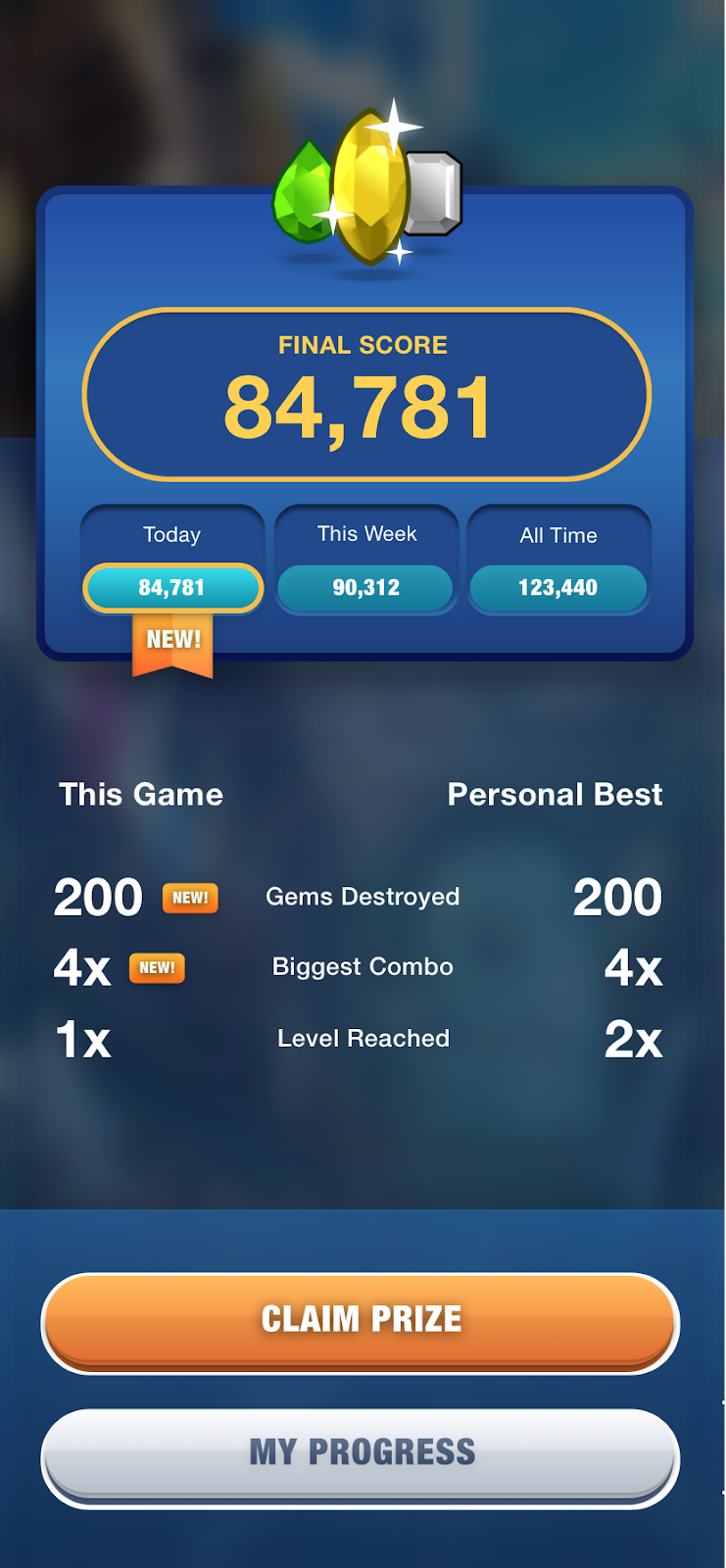
The Score Summary Screen is used as a convenient place to reflect a player’s personal records and high scores. You can see this in the example screenshot from Diamond Strike. We recommend leveraging the Progression API to store statistics such as High Score or Best Combo as custom PlayerData keys and then comparing a user’s personal records to their current match.
If your game contains progression mechanics, you likely will want to display the player’s progress on those mechanics in your post-match experience.
So long as you properly implement the new split methods for SubmitScore and ReturnToSkillz, then it is safe for you to provide an alternative path to your progression experience via the score summary screen, provided you give players a way to return to the Skillz UI when they’re ready to play their next match.
See here for details on Progression.
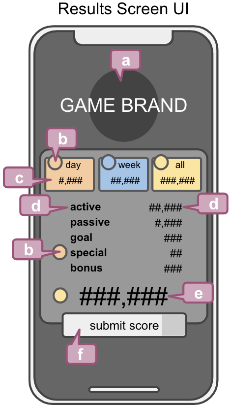
Example Framework for Score Summary

a. Game Branding - Visual elements that carry forward your game theme
b. Badge - used to indicate when a user has set a personal record or achieves some other progress
c. Best Score - Skillz recommends tracking a player’s Best Score for the day, week, and all time via the Progression API and reflecting that information back to the user at the end of each match
d. Line Items and Score - short description of the key actions that contribute to a player’s score with their associated points earned
e. Final Score - Player’s final score. Ensure that if your line items are all score elements that they sum correctly to your final score
f. View Results / Primary CTA - used to return to SDK
Leveraging Animation to Create Dynamic Choreography
Kinetic animation helps reveal large amounts of information without overwhelming players. Like dominoes, animation should lead the players eye, providing anticipation and impact.
Here are some successful Kinetic Ingredients you can use in your score summary:
NOTE: The final reveal should take no more than 2-3 seconds before showing the final score.
- Staggered Reveal - Build choreography and animation which layers in scoring elements. This technique will allow a more dense score summary to be communicated without overloading players
- Roll-up and Slide-in - Create attention for specific areas of the screen by focused movement. Amplify the energy of an element by making it feel like it charges or fills up before punctuating the ending.A classic example is to “tick up” your final score as it animates on screen. Rolling text and bursting particles are also a great way to do this
- Confetti - Use confetti and particles to liven up a static result screen. Just be careful not to create so much noise that the dialog is difficult to read
- Audio Punch - Accompany the choreography with a timed jingle or roll-up sound so that players can learn to expect and anticipate key beats which reinforce the size of their success
Additional Best Practices
- Keep information clear and focused
- Show incremental progress when possible
- Build screen elements w/ exciting animation and choreography
- Allow simple passthrough which speeds up animations w/ a tap for impatient players
- Final score should be the most prominent item on the screen - other numerical items should be displayed in a separate area with a lower priority text class
Things to Avoid
- Illegible fonts or too much abstraction
- Composition, reveals, or animations which cause distraction or hinder focus
- Slow choreography or sleepy effects
- Long, blocking animations or loading